 $FUNCOIN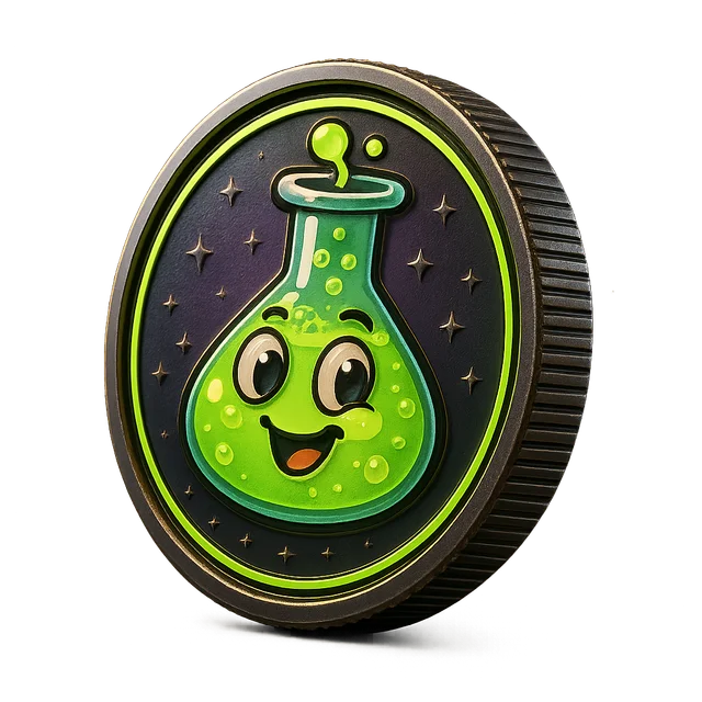
Meme coin logo ideas that still work at 32 pixels
Meme coin logo ideas with mascot poses, color palettes, badge shapes and type tips. Explore logo directions that read clearly at avatar size, then refine.
Generate logo ideasA meme logo lives most of its life very small: a profile picture in a reply thread, a sticker in a chat, a favicon in a browser tab. That means the best meme coin logo ideas are less about detail and more about a single, instantly readable face or shape. If someone can recognize your mascot from across a crowded feed, the logo is doing its job.
Most memorable meme logos fall into a few families. The round badge puts the mascot's head inside a thick circle, like a coin or a sticker. The full-body sticker shows the character in one pose with a white outline, so it pops on any background. The wordmark-plus-face pairs a chunky name with a tiny mascot head as the dot of an i or the middle of an O. And the expression close-up crops tightly on one exaggerated face, such as a squinting cat or a crying frog, letting the emotion carry the joke.
Color does a lot of the work. Two strong colors plus black or white usually beat a full rainbow. Think lime and purple for chaotic energy, warm orange and cream for cozy characters, or electric blue and yellow for loud, cartoonish brands. Thick outlines, simple shading and one standout feature, like oversized eyes or a tiny hat, keep the mascot readable when it shrinks.
FunCoin Lab generates logo concepts from your brand: a written brief covering mascot, pose, expression, palette and type, plus a generated badge you can preview. Use them as a sketchbook to compare directions quickly, then refine your favorite in a design tool or hand the brief to an illustrator. AI image generation uses credits, and every concept should be checked for originality before public use.
Highlights
Four proven formats
Explore round badges, outlined stickers, wordmark-plus-face lockups and expression close-ups for the same mascot to see which reads best.
Brief plus visual
Each concept comes with a written design brief you can reuse, alongside a generated badge preview of the idea.
Palette suggestions
Get two or three color combinations that match your mascot's personality, from cozy and soft to loud and chaotic.
How it works
Start from a saved brand or mascot
Pick a concept you already made or describe the character, its personality and one feature that defines it, like a cracked shell or a tiny crown.
Generate several directions
Create concepts in different formats and palettes. Seeing a badge, a sticker and a wordmark side by side makes the strongest option obvious.
Test at small sizes
Shrink each concept to avatar and favicon size. If the face turns into a blob, simplify the shapes or increase contrast.
Refine and check originality
Polish the winner in a design tool, run a reverse image search and a trademark check, then build the rest of the art kit around it.
Tips that actually help
- Build a mini sticker sheet
- Once the main logo is settled, sketch four or five variations: the mascot waving, sleeping, shocked and celebrating. A small sticker sheet gives your community ready-made reactions and keeps every piece of art recognizably part of the same brand.
- Exaggerate one feature
- Huge eyes, a tiny hat, an oversized grin or a single tooth. One exaggerated feature is easier to recognize than several small details.
- Use a thick outline
- A white or black outline around the mascot keeps it readable on dark mode, light mode and busy meme backgrounds alike.
- Pick an expression, not a pose
- Small logos show faces better than bodies. A smug squint or a panicked stare says more at 32 pixels than a full action pose.
- Plan for variations
- A good mascot logo can be redrawn in different moods: happy, sleepy, shocked. Those variants become reaction stickers and meme templates later.
- Stay clear of existing characters
- Avoid anything that resembles well-known cartoon characters, brand mascots or real people. An original design is safer and more memorable.